Content Strategy for a Better PPC Landing Page
Lessons and opportunities to employ in your next campaign
Welcome to the ninth edition of Full Stack Content.
As it turns out, writing long-form essays each week is a lot of work. So, I’m considering other forms of content to ease the pressure that I feel about bringing value to your inbox.
Please take this brief survey to help inform the future of this newsletter.
Now, without further ado... on to today’s post!
Coming off of last week’s article about headlines, I knew that I wanted to write about landing pages. I thought about tackling 👁👄👁.fm or HEY.com.
After considering my content strategy, I decided that pontificating on those trendy topics may not be relatable or provide long-term value. So instead, here are a few lessons (good examples) and opportunities (bad examples) of content strategy that I found in the wild.
What is a PPC landing page?
PPC stands for pay-per-click. PPC is an advertising model in which advertisers pay a fee each time one of their ads is clicked. You’ve undoubtedly seen PPC ads whenever you search for something on Google. You’ve probably encountered PPC ads on social media or as display ads on the sidebar of a news site. Even those (retargeting) ads that follow you around from site to site are a form of PPC advertising.
A “PPC landing page” is any page where visitors land after clicking on a pay-per-click ad.
Content strategy can have a disproportionate impact on the effectiveness of a PPC landing page. So, let’s examine a few pages to see what we can learn.
I searched “User Onboarding Software” and clicked on the four paid search results.
Lesson 1: Identify your audience in ad copy to prevent costly irrelevant clicks
Google’s search results are dominated by PPC ads. The first four results are advertisements, leaving only two spots immediately visible on my 15” display. These ads are composed of discrete components and the advertiser has very little control over which components display.
According to 99 Robots, “A search ad on Google currently consists of the ad itself (headlines, descriptions, display url) along with the many ad extensions (callouts, sitelinks, call extensions, location extensions, seller ratings, price extensions, promotion extensions, etc.)”
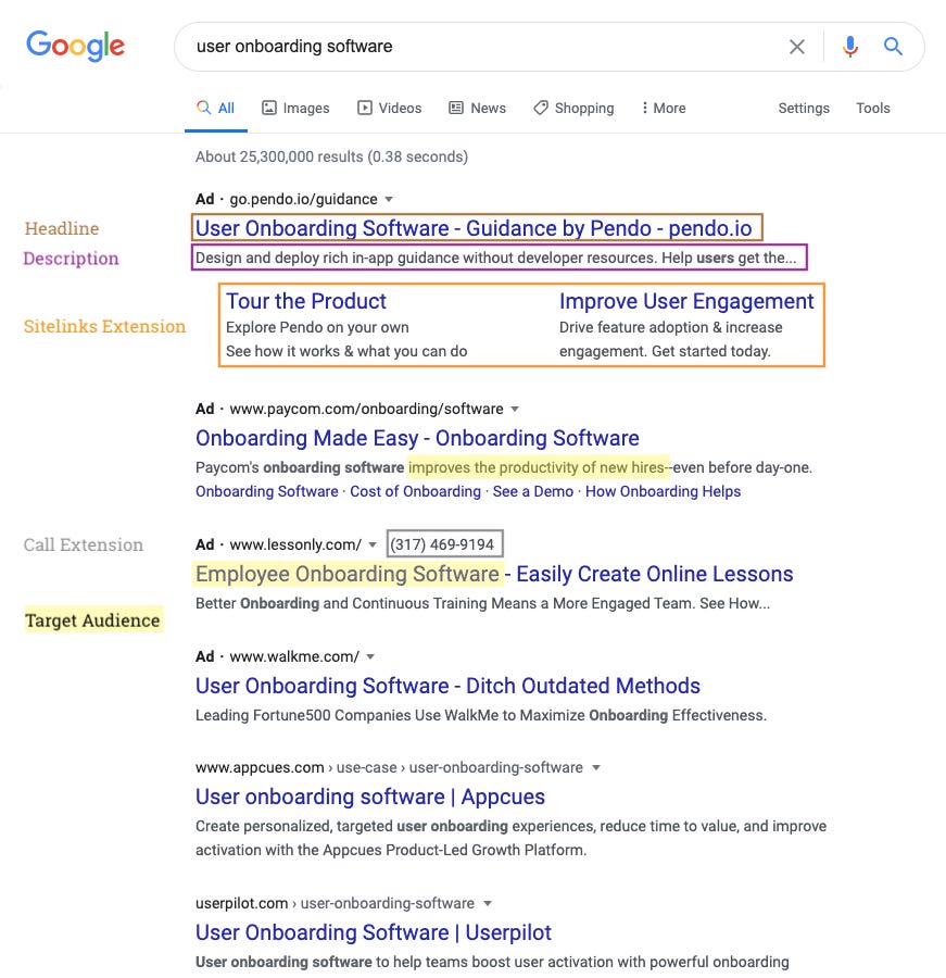
Remember, each click on one of these ads costs the company money. So, it’s important that these ads help the user quickly determine whether or not a product might be helpful. For example, Paycom and Lessonly seem to be products for “employee onboarding” which doesn’t match my intent when searching for “user onboarding software.”
Now, on to the post-click experience.
Lesson 2: Put your form above the fold
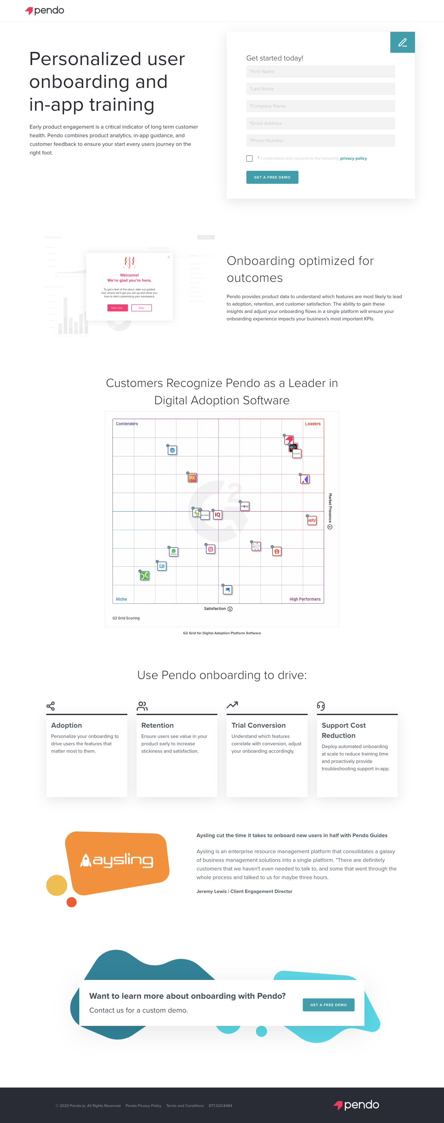
Pendo does a pretty good job with the hero area of their landing page. The headline content (hook) makes it clear that Pendo provides user onboarding software. The subhead (promise) also accomplishes two important tasks:
Reminds me that the stakes are high
Describes features available in the product
While I commend Pendo for putting the form in such a prominent position, it’s not without room for improvement.
Opportunity: Reduce the number of required fields
These are the questions that ran through my head.
What are they going to do with my last name?
Can’t they figure out my company from my email address?
What if I don’t want to give up my phone number?
Opportunity: Clarify the point of the form
The header on the form says “Get started today!” while the button on the form reads “Get A Free Demo.”
Which is it?
The header implies that I’d be able to try the product… today. The button suggests that a sales guy will contact me to schedule a meeting.
Lesson 3: Use GIFs to illustrate your points
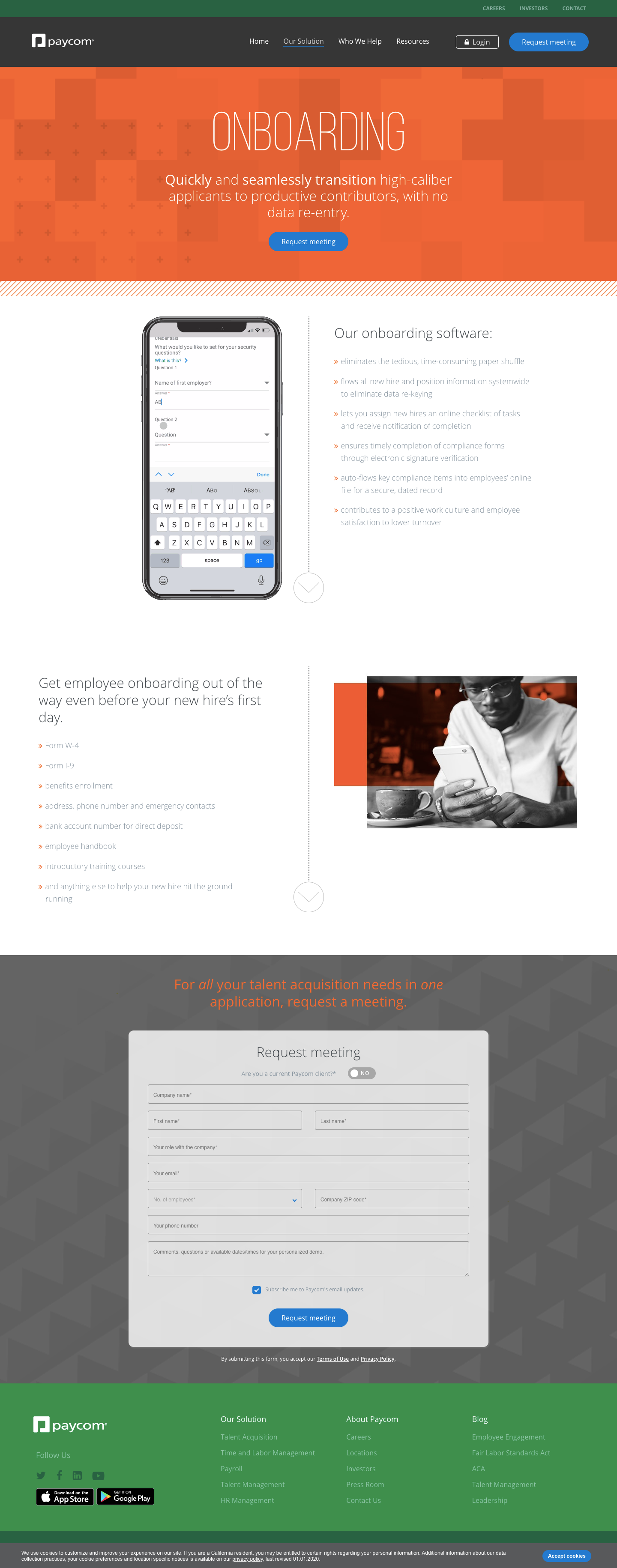
I’m sorry to say that there isn’t much I like about this landing page by Paycom.
One thing they’ve done reasonably well is use an animated GIF to show how their app actually works. The GIF sits alongside six bullet points and provides a nice visual anchor on the page.
Like Pendo, Paycom should clarify the point of their form. What is the meeting about? Why do you need to know the company zip code? Do I use the zip code of my local office or corporate HQ?
Perhaps more importantly, Paycom should reconsider its headlines.
Opportunity: Make the headline SCREAM
Two free online tools I like to use when evaluating headlines are the EMV Headline Analyzer and a readability score such as Flesch-Kincaid Grade Level.
Original headline: Quickly and seamlessly transition high-caliber applicants to productive contributors, with no data re-entry.
EMV: 23.08% (Intellectual)
Flesch-Kincaid Grade Level: 14.6
Suggested revision: Streamline onboarding, improve data quality, and impress new hires.
EMV: 55% (Intellectual, Spiritual)
Flesch-Kincaid Grade Level: 10.2
Although more subjective, I also use the SCREAM framework for evaluating headlines. In my opinion, this revision is more Specific and Clear. This revision is equally relevant. This revision is more ambitious (it promises three outcomes with no silly adverbs). The Rule of Threes suggests a website visitor will more easily remember the revision which makes it ownable (or Mine).
Lesson 4: Let your customers do the talking
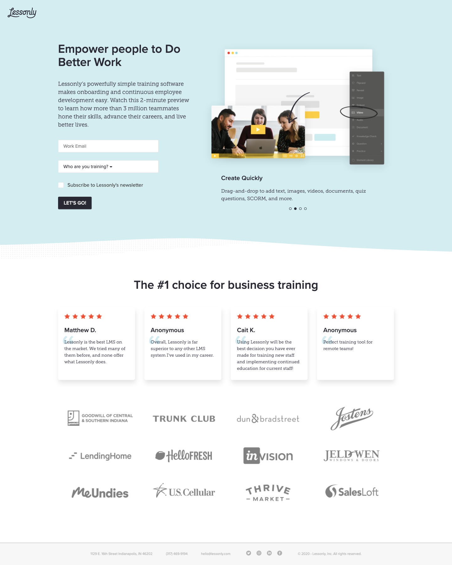
Lessonly has a nice and simple form. Their hero area has a carousel that explains different features. This leaves me with the impression that their product is designed well.
The thing I like best about their page is the use of social proof. Testimonials can be a very effective persuasive device. What’s really great is that these testimonials link back to their source (G2).
Opportunity: Add visual indicator that elements are linked
There is only a subtle shadow effect on hover to tell me that these testimonials are linked back to their source. If I were on a touch device then I wouldn’t be able to tell these were clickable at all.
Lesson 5: Remind people about their pain
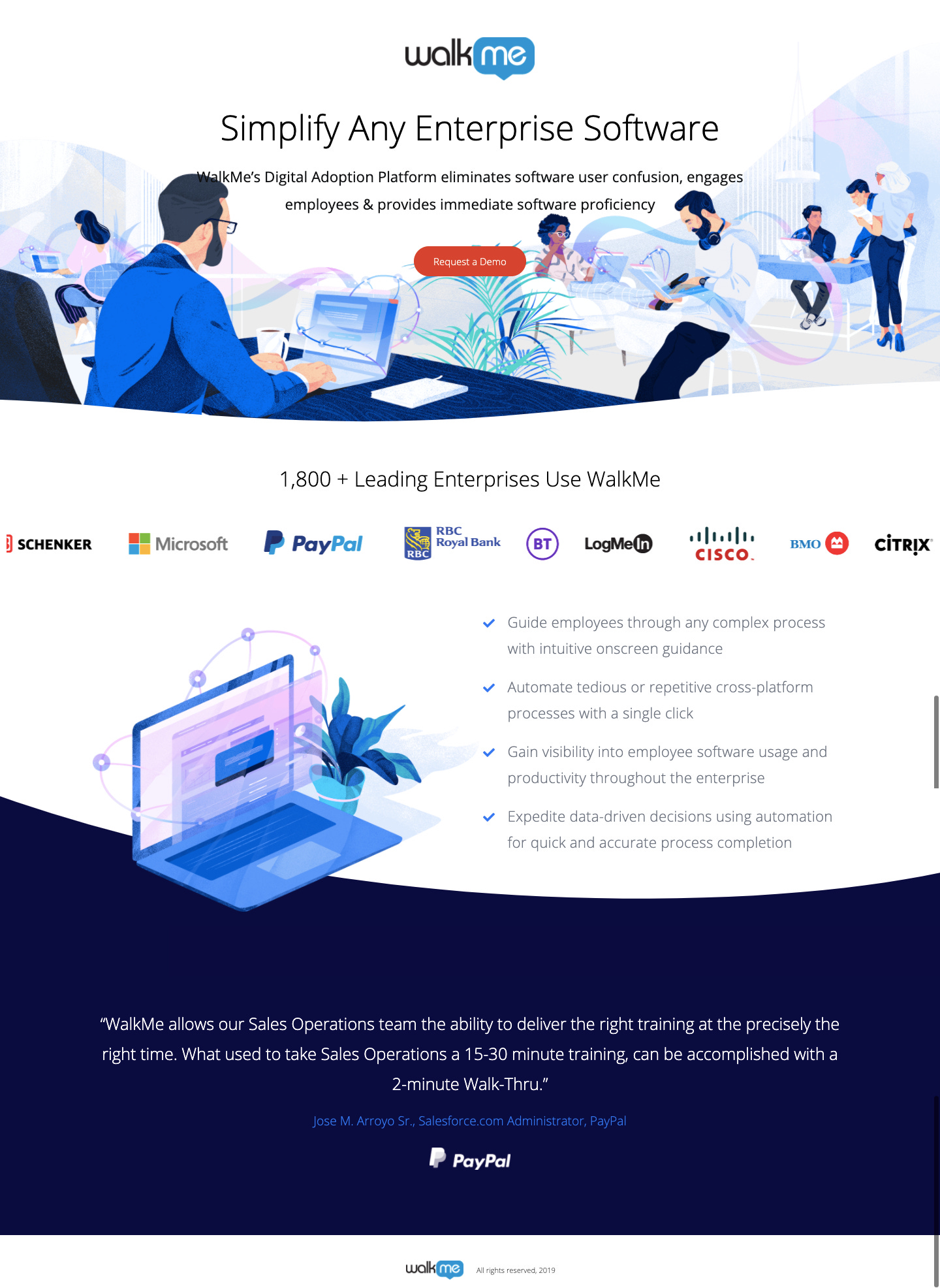
Enterprise software has a reputation for being pretty bad. WalkMe does a great job making it clear that their audience is the enterprise.
They also point out the pain of working with enterprise software in the hero area and throughout the page. For example, “Eliminates user confusion” is a strong phrase that people can relate to. The associated imagery supports this idea. Presumably, the wispy tails around the devices are WalkMe’s product working its magic.
Opportunity: Use personalized messaging
I searched for “User Onboarding Software” but WalkMe describes their product as “Digital Adoption Platform.” If I were in a hurry, it’s entirely possible that I would have bounced off the page thinking that this product wasn’t right for me.
—
Don’t Forget to Help Me Plan Future Editions
I’ve been writing this newsletter for nine weeks. Somehow, each week there are new people who find their way here and think this content is valuable enough to subscribe. Thank you!
Finding inspiration for long-form essays is a lot of pressure. Help me help you. Please!
Support This Blog
Writing this newsletter takes a considerable amount of time, energy, and caffeine.
Join me at the Product-Led Summit
My next talk “Use Science to Write Better Copy and Acquire More Customers” will premiere at the Product-Led Summit (July 27–31, 2020).
This talk explores science-backed frameworks to:
Identify what your users need
Organize your landing page
Write copy that motivates users
This session is perfect for anyone who wants to learn a rigorous (but not overwhelming) approach to writing ad copy and designing landing pages.
Thanks for making it to the end! Please like this edition of Full Stack Content by clicking the ❤️ below, which helps the algorithms and encourages more people to join the dialogue.
You can email corrections/feedback to contentstrategy@substack.com.


